Okay, for those just joining, this is the conversation: Rick Leonardi is a fantastic artist too few know of or discuss and he drew a series too few remember called Cloak & Dagger - both are among my favorite things in all of comics; Cloak and Dagger are now part of a team called "Dark X-Men."
And let me say this about that: they are a perfect fit as "dark" X-Men. Tandy Bowen and Tyrone Someone (I can't remember it, my Cloak & Dagger comics are in the bottom of the bedroom closet, and the Marvel Universe hasn't listed the article yet) were runaways who were kidnapped and experimented on by drug-dealers who were looking to street a new addictive substance. The experiments mutated them into Cloak & Dagger. Their powers work together in a symbiotic sense, in that Cloak "feeds" on "light" (as in the good and positive in people) and Tandy is the embodiment of such; Dagger feeds Cloak, which keeps the Darkness from consuming him totally. Their backstory and characters make them excellent candidates because it all fits perfectly with the X-Men and the whole "Dark" nonsense.
But what I wanted to discuss was Leonardi's work and why I feel it was so good: the quality of the printing in comics then.
Let me go on record as saying if anyone out there wants to do it, I am 100% for purchasing some of the older printing presses comics used to be manufactured on and making a go of it; these new "magazine-style" comic books (called "slicks" throughout the writing/magazine industry specifically in reference to their appearance) are at least some-odd percentage to fault for the lack of excitement and fun in the field today. The quality of the paper is simply too much for comic books and no one working in the field has discovered a method which capitalizes on it yet. Rick Veitch's work looks fantastic on slick paper, but (IMO) pretty shitty under the old process; no one else's work looks good under the new process - no one's.
Some pop-artist did a series of well-known paintings based on comic books back in the 80s. His expression dealt with romantic themes, not superheroes, and the entire point of the series was the Pointilist effect comic books used to have because they used toner for color and shading. The absence of superheroes was far from the only aspect which made the point, and that fact was hardly even noticeable; the point was the dots (toner) and the line styling. Further, it was testament to his observation that the process changed only a few years later. I should find out who the artist was and highlight the series, because it was extremely important in bringing comic books into mainstream Art conversations. My lack of direct knowledge and digressions renders this point moot, but let's just say that, when a fine artist decided to highlight comic book art as a style within the Fine Arts, his expression was specific in its focus on word balloons, solid line art, and toner coloring.
Comic books are now colored by computer and the process really is more mechanical than is necessary, leaving a lot to be desired. While the coloring is far more realistic and some truly incredible efforts have been achieved, by and large, it has been to the detriment of the form. Working with toner is a real pain in the ass, but it is so worth it when it's done well! Now more than ever, the use of toner is an artistic decision playing into the artist's style, and too few use it anymore (myself included, though I've never used it).
My personal take on this is that too many artists overdraw. This is all Image's fault - the whole thing - right down the line! They moved to computerized processes and slick paper because they wanted to be able to render in more "detail" (read: crosshatch the shit out of everything on the page). But it doesn't have to be such a wreck; too many artists in the field start out as fans and they're all going by what their favorites did before them.
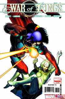 The key to working on slick paper is less line art, not more; leave the details to the colorists. Not only can computers render them better, they will also achieve the photo-realism so many are going for. The cover for War of Kings #2 is a good example (included). Cover artist Brandon Peterson used solid lines and left the detailing to the colors; no crosshatching or other line-art shading techniques were used (though he may have used wash). The result is a phenomenal piece of cover art, though I've no idea if that level of quality could be achieved throughout an entire book - certainly not a monthly (not on a regular basis, I'm saying). Still, that is what we should be striving for when working on slick paper.
Leonardi is a master, period. That's why he's so often a fill-in artist; he can do what needs to be done and get it done on time. However, his work literally OWNED back on the lesser-quality paper - as did many of his contemporaries'. I'm sure some of it has to do with the fact that not only were they comfortable with the paper quality and printing process, but had learned from peers who were, too. The next generation of comic book artists are going to be ten times better than we are today for the same reason: they'll have our work to go by.
So: Cloak & Dagger are a great fit for a Dark X-Men team, but no one will ever be able to render them like Rick Leonardi (who is an occasional fill-in on Uncanny - or was) and slick paper sucks for comics.
© C Harris Lynn, 2009
The original artwork for Uncanny X-Men #257 went for $15,000 on eBay recently.
The artwork featured Psylocke and Wolvie, as rendered by Jim Lee. It was signed and included the color plates.
This was right as/before Jim Lee was coming to prominence within the field. He had done some work on Punisher War Journal and a few other titles, but nothing truly impressive. A lot of pencillers start out that way: Their first few outings are mediocre and usually further compromised by incompatible inkers. They also generally start out with only some penciling duties, such as layouts and breakdowns, or finishes. The really good ones eventually find their way and take over full penciling duties, if not the whole shebang, on one book at a time. (Remind me to explain why pencilers only work on one book at a time, whereas other important contributors, such as colorists, letterers, editors, and even inkers, often work on more than one.)
And while Jim Lee is a standout in the field and definitely one of my favorites (his work at that time is some of my favorite in the field, at least -- I quit paying attention after he moved to Image and all those guys started doing The Crosshatching...), there is an artist in the field most people may not be [consciously] aware of who is and has been one of my favorites since I was a kid. Actually, I'll sing the praises of two:
The first you may be aware of, since he worked with Frank Miller on two seminal works (Daredevil and Batman: Year One): David Mazzuchelli. Mazzuchelli's work (he does the whole thing, except coloring) is clean and crisp and always strikes that fine line of hyper-realism and caricature we all strive for.
His work on Year One is particularly impressive because of its pitch-perfect period stylization, but his career highlight was definitely his run on Daredevil, which was hit and miss under Denny O'Neil then hit its stride under Miller's words. Of course, that particular run on DD was some of Miller's absolute best work and started off his own career peak, so far (one-year run on DD, Elektra: Assassin, Dark Knight Returns, Year One).
But Mazzuchelli, while mentioned far too rarely, is fairly well-known and my real raving here is for possibly my favorite comic book artist of all time -- the guy whose pencils made me want to learn to draw comics: Rick Leonardi.
Rick Leonardi is not a household name, even among comics fans, and there's a reason for this: While he has worked on basically every major Marvel character there is, he's a fill-in. The guy's output must be phenomenal -- and there are more than a few issues where you can tell he pretty much phoned it in (Daredevil 249 [I believe] with Wolvie being one of them) -- but Leonardi knows the human form the way your Grandma knows her kitchen. The way you know which buttons to push when you... he's good and, apparently, very fast at being good.
Someone once said, 'In order to draw comics, you need to be able to see a man jump from a window and draw him before he hits the ground.' Rick Leonardi must have pushed a lot of people off a lot of ledges -- practice makes perfect!
Rick Leonardi has filled-in on so many Marvel comics, you can't count them, so you've most likely seen his work. His best work was Cloak & Dagger (unlimited) under Bill Mantlo's writing efforts. Whatever he did or worked out on that title, he absolutely owned those characters. Only Art Adams' (another favorite) cover for #9 (or was it 10?) -- Cloak's pervertedly distorted smile -- ever came close to capturing those characters the way Leonardi did with total ease.
His most popular issue is likely to be the seminal battle issue between Wolvie and Sabretooth (Uncanny X-Men #212) which was one of my very favorite issues ever and forced me to cut out the subscription coupon in the back because I wanted every comic book I read to have art like that and I had to have that comic book open every time I sat down to draw because it inspired me... and then it shot up to astronomical value rates because slavish fanboys thought Sabretooth was "k3wl." But I digress and I apologize, because I am as much a slavish fanboy as anyone else.
Rick Leonardi's pencils grace many a book and, depending on the inker involved and when it was done, are second to none. As I got older, I noticed he took on a rounder, cleaner, more "stock" style (it has to do with tracing "stock" features and poses -- remind me and I'll explain it sometime... along with The Tick Syndrome and comic book pacing and why DK2 was a sad, cynical, sort of parody of the original [replete with Jack Davis stylization] and any other "inside terminology" that I may or may not have made up, including the thing I mentioned above and told you to remind me about later) and I assumed he was either getting old and didn't draw as much, or that he had moved onto greener pastures and just threw any old shit into a comic, as needed. I later put together that he is a fill-in penciler
[An Aside: I knew that from before, because he was always showing up in other books. I literally used to thumb through the monthlies I didn't read just to see if he was the penciler -- something no comic book store owner likes, no matter how careful and earnest you are.]
and fill-in cats are sometimes called-in at the very last minute.
What usually happens is that they throw down very specific, easy-to-follow breakdowns for the inker. Sometimes, a finisher is needed as an intermediate step but it generally goes from one very good breakdown artist to one very accomplished inker, and the results are completely mixed -- some are fantastic but many are aggressively mediocre.
The whole "inkers are tracers" bit from Chasing Amy, while I'm 100% positive some fans believed that, is silly because inkers finish pencils. Remind me to tell you more about that one day, too.
Well, go find you some Rick Leonardi work to gawk at and I'll try a lot harder to lay down some groundwork for future discussions. I realize I've probably lost half the audience by now but it's really hard for me to discuss funnybooks and how to make them because there's a lot of "inside" shit I don't even think about until I mention it, then I end up with a blog full o parentheses and dreaded ASIDES...


 The key to working on slick paper is less line art, not more; leave the details to the colorists. Not only can computers render them better, they will also achieve the photo-realism so many are going for. The cover for War of Kings #2 is a good example (included). Cover artist Brandon Peterson used solid lines and left the detailing to the colors; no crosshatching or other line-art shading techniques were used (though he may have used wash). The result is a phenomenal piece of cover art, though I've no idea if that level of quality could be achieved throughout an entire book - certainly not a monthly (not on a regular basis, I'm saying). Still, that is what we should be striving for when working on slick paper.