 |
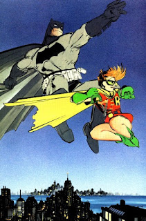
| Dark Knight Returns |
I can't imagine any serious comics fan who doesn't know the story but, for anyone who doesn't, an aged Batman comes out of retirement just in time to stop a gang of youths from taking over Gotham City. He goes on to face his arch-nemesis, the Joker, as well as his sometime partner, Superman, and trains a new Robin.
Dark Knight Returns (DK1) is one of the most highly-regarded works in the entire field and was released the same year as Alan Moore's magnum opus, The Watchmen (Moore does the introduction to the DK1 collection, in fact). This, along with several other groundbreaking works, is why 1986 is such a watershed year in comics -- and a watershed year for entertainment and pop-culture, in general.
Dark Knight Strikes Back (DK2) was released in 2003 or around-abouts and picks up three years from where DK1 left off.
DK1 featured Frank Miller at script and pencils, Klaus Janson (of Punisher fame) on inks, John Costanza: letterer, and Lynn Varley (Miller's wife at the time) on colors. It is very dark, very Gothic, very gritty -- and is the work that started that very trend which continues to this very day. (Miller had a knack for trendsetting back in the 1980s: His work on Daredevil, specifically involving Elektra, and the four-issue Wolverine mini-series he did with Chris Claremont fueled the ninja craze of that time.) It was also the primary reference for Tim Burton's blockbuster Batman film. It is one of the most brilliant works ever published in any medium and there's been more ink spilled over it than probably half the founding documents of our nation.
DK2 featured Miller on everything except letters (Todd Klein) and colors (Varley, again). But the style he used is completely different. His style on DK1 was pure Miller and the real look of it came from Janson's chunky inks, which gave it that gritty hyper-realism for which it is so famous; the style he adopts on DK2 is downright satirical. It's this Jack Davis style, where the feet and hands are freakishly larger than the head (an old superhero trick: Draw the head smaller to make the character look more imposing and superheroic) and everything is really a caricature of itself.
I don't like it.
He mentions, in Eisner/Miller, that his whole focus in DK2 was fashion. The "superhero look" is a fashion trend in the second book, but only slightly moreso than in the first -- to the extent that, had I not read this, I might not have realized its significance. So, I know this style was intentional, but Miller's art is not exactly "clean" by nature, and it didn't work.
I abhor The Crosshatch (something most of the Image artists did for far too long: A sort-of cribbed Bernie Wrightson style with thousands of thin lines for no damn reason), but love the people that have that clean, thin line style even without The Crosshatching (my favorite being Art Adams and Jim Lee). Miller's is a thick, chunky, glob-o-ink style that doesn't lend itself easily to cartooning of this nature.
I love Miller's work but, if he planned to go that far into the hyper-realism, super-clean cartoon style, he really only got as far as Jack Davis. And Jack Davis didn't draw superheroes.
The other artistic flaw is the coloring. I hate to say that because Lynn Varley is probably the best colorist in the field and has been for decades (this is not news), but she did the colors on this book with a computer... and I'm not sure if she knew what she was doing. Or, better yet, exactly what to do. Some of the panels and splashes are amazing! Most of them though, are just... pointless pseudopsychedelia.
The thing with backgrounds is twofold: Without them, the figures and action "float." There's no sense of space or positioning, so it's just talking heads and floating figures. The other thing is pacing (which I had not really considered, or at least put my finger on, until I read Miller discussing this): Panels without backgrounds "speed" the tempo.
Manga has few backgrounds and that's one reason it moves so fast. DK2 has, at most, ten panels with backgrounds and even those aren't full backgrounds! While it moves faster and the characters don't really "float" (Miller's too experienced for that), Varley has all this flower-power, "Look, ma! I got a Mac!" shit going on back there. It's very distracting -- to the extent that it slows everything back down!
DK1 had so much background because Gotham was a major supporting character. Since DK2 is set elsewhere, the lack of focus on the background is understandable, but the utter lack thereof is a major flaw and total distraction.
The writing wasn't as good on DK2, either. First of all, Miller cheesed on the dialogue. At least the first chapter of DK2 reads like he hadn't read DK1 in years and only picked it up to check out what slang he'd invented; it reads like he dusted off his research notes and just lifted words and phrases without trying to make them fit to the character(s) and situation.
The other problem is that he didn't finish it! It just... ends; it's not a cliffhanger, it's not a "choose-your-own" or "and life went on," Grapes of Wrath sort of thing: it just... stops. That's why I always refer to both books together as a "saga."
I mean, I'm hoping there's going to be more of it. Um... I hope.
DK2 is a great read, mind you. I loved it the first time through but was disappointed by the ending. I liked it better on subsequent readings. But it doesn't stand up to DK1 and, if you haven't read either, Dark Knight Returns is the one to get.


No comments:
Post a Comment